


KERA’s Art&Seek is covering the 2015 South by Southwest Conference in Austin. Read more coverage from this and previous years in our SXSW archive.
When building digital apps for kids, chaos may be the best approach.
That may sound anathema for a company known for its beautiful design and well-planned user experiences, but the Swedish/American interactive firm Doberman has learned a lot from its foray into children’s software. As Doberman CEO Lisa Lindström and Experience Strategist Kerry Bodine outlined in their SXSW session on Friday, those lessons have changed the way they design for adults too.
Takeaways about designing for kids can just as easily be applied to adults, according to Lisa Lindström and Kerry Bodine. (via @jmikemcculloch on Twitter)
Lindström and Bodine opened their presentation by discussing the rather short history of organized kids play. From Roman times through the mid-19th century, once children grew out of infancy they were treated much like adults: if you were wealthy, you often began schooling where play was not a component, and if you were poor you were generally pushed into manual labor at an early age. The first playground in the United States wasn’t even built until 1887, in San Francisco’s Golden Gate Park.
Now, however, play is recognized as an integral part of childhood, and incredibly important to intellectual and emotional development. Interactive games for children have been a growing segment of the software development industry for years; as technology evolved, that market exploded into tens of thousands of games and educational apps, as devices became more powerful and less expensive overall.
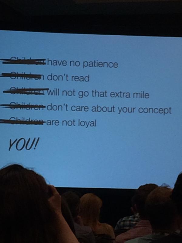
Websites designed for kids in the early days of the Internet seemed to focus on bright colors, bold text and cute pictures, but otherwise weren’t much different from sites aimed at an older audience. However, Lindström and Bodine said research has shown that kids have very different cognitive, motor and social skills – and thus a different set of needs that digital experiences must meet. For example, kids under age 8 often struggle to differentiate between content and ads, and kids under 3 aren’t capable of the level of abstract thought needed to connect a picture or icon with the real thing it stands for.
Given these realizations, their firm set out to design their kids games through a careful iterative process of research and design – and soon learned that none of their approaches were really working. Scavenger hunts to simulate a user experience path were “boring”; simple worksheets to gauge interest and reaction weren’t completed. So, they moved from what the duo termed a “production society” approach – insight, strategy, design and production – to a “prototyping society” model, where they constantly moved back and forth between the different development stages, with different teams working on different elements based on how kids reacted to them.
“Maybe children aren’t clueless,” Lindström said. “Maybe children are the clue.”

A two-minute sketch of a banking user experience designed for four-year-olds (via @michelle_pujals on Twitter)
As part of the new model, their team members “embraced chaos” – they just watched how kids played, and maintained a loose agile development schedule so they could constantly make improvements to different areas based on the reactions they got. They also threw out the rules and ignored earlier ideas about a fixed process, in order to let the kids’ input drive the user experience design process. In the session, Lindström and Bodine gave each of the audience members a Post-It Note and a marker, and asked them to design a basic banking user experience designed for a 4-year-old in two minutes. Lindström posted several of the resulting designs on Twitter.
You’d think adults would be markedly different, but Lindström and Bodine said their research has actually improved their design work for adult applications. By moving to a more loose development schedule for subsequent projects, such as a site for health insurance firm Oscar, they have been able to declutter their user experience into beautiful, simple layouts with a friendly tone of voice – and the reaction from clients and users has been overwhelmingly positive.
Their last bit of advice for those embarking on digital development is to ditch meetings whenever possible and focus on play: What can you learn from games that you like? What websites you visit for fun “just work,” and thus inspire you to visit them again?
Although their presentation was cut short by an ill-timed fire alarm that emptied the session, Lindström and Bodine clearly articulated their point that a systematic, staged approach to development may not always be the best approach for kids or adults. Instead, spend your time planning “play” for potential users – interacting with games that can help inform your application’s design, trying out pieces of your work and discussing other sites or games that they love.